What is a good visual
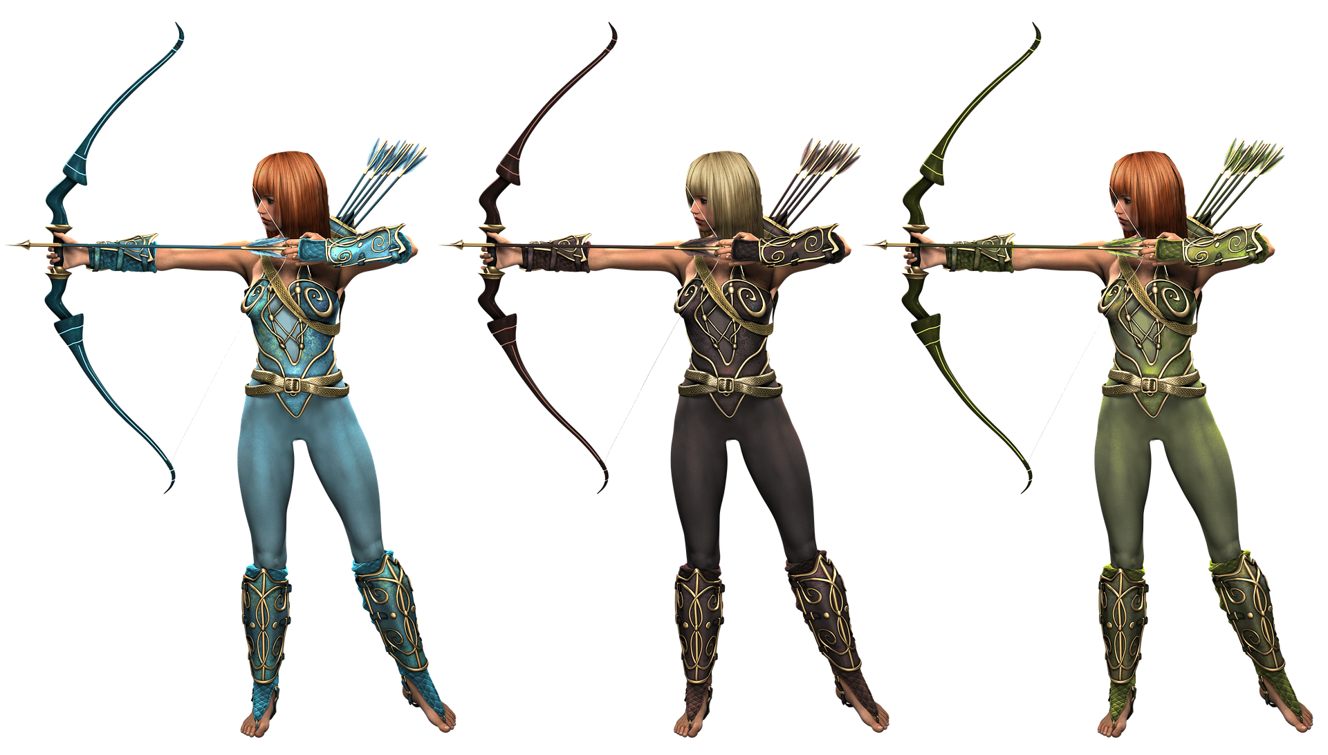
This visual is good to look at.
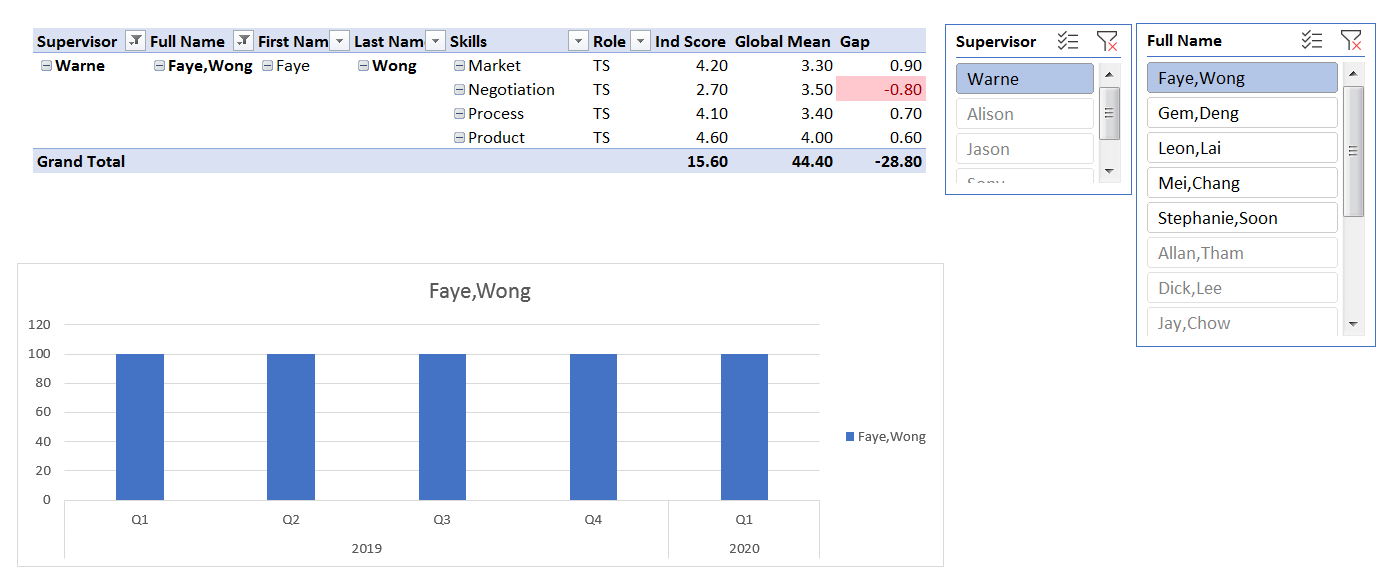
But it is not practical. In fact, it is disruptive to analysis because the flow of information “jumped”.
A good visual should be easy and quick to understand, within a few seconds of looking at it.
The visual should flow with the analysis.
In this visual, even though the presentation is to show the distribution of the views among the different age groups, the 2 bar charts (represented by 2 different colours) are drawn with different scales. By presenting them together, it gives the impression that the purple bar is more than the green bar. But in actual fact, it is less than . Hence it is disruptive in analysis.
#dataanalytics #business #marketing


